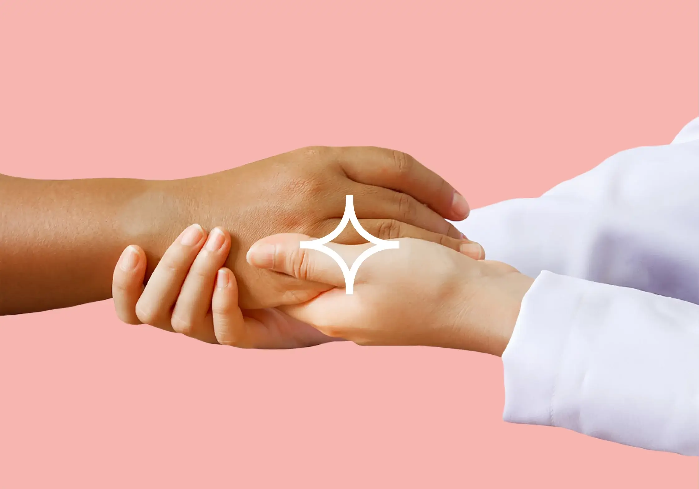
Giving patients a sense of control and responsibility over their health is an important aspect of patient-centered care. When patients feel empowered and engaged in their own health, they are more likely to be motivated to make healthy lifestyle choices, adhere to treatment plans, and actively participate in their own care.
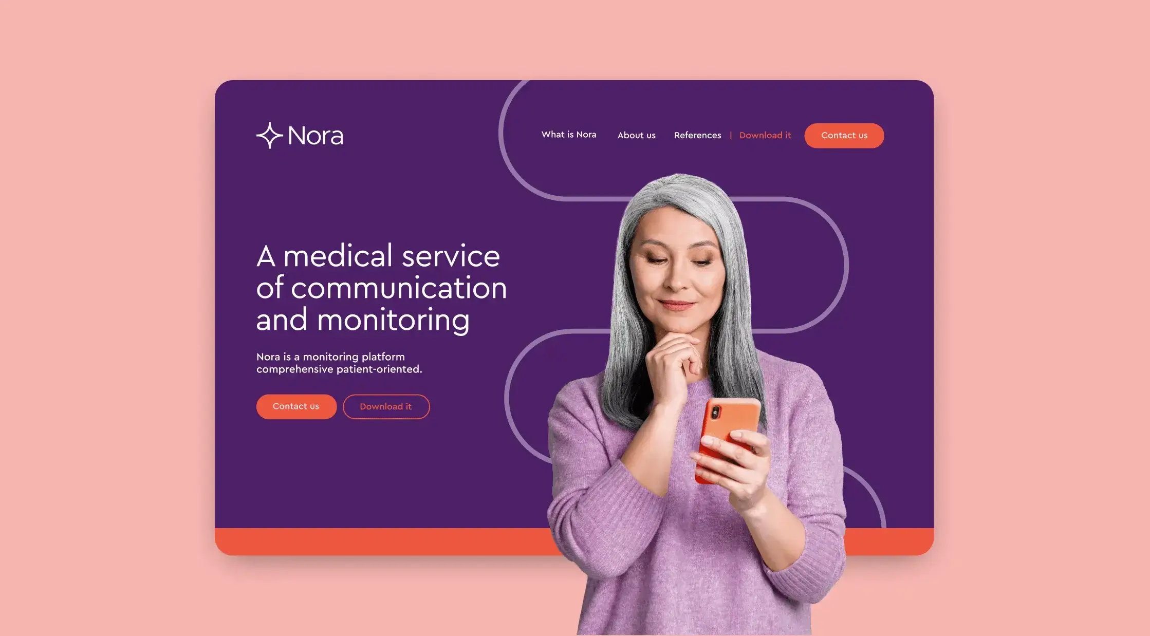
Nora is an app designed as a communication tool between patients and doctors. The product offers a holistic approach of medical monitoring for chronic patients. Being a high tech solution to the benefit of the patient through a humanized service, we developed a brand and its digital presence.
User-focused content reorganization
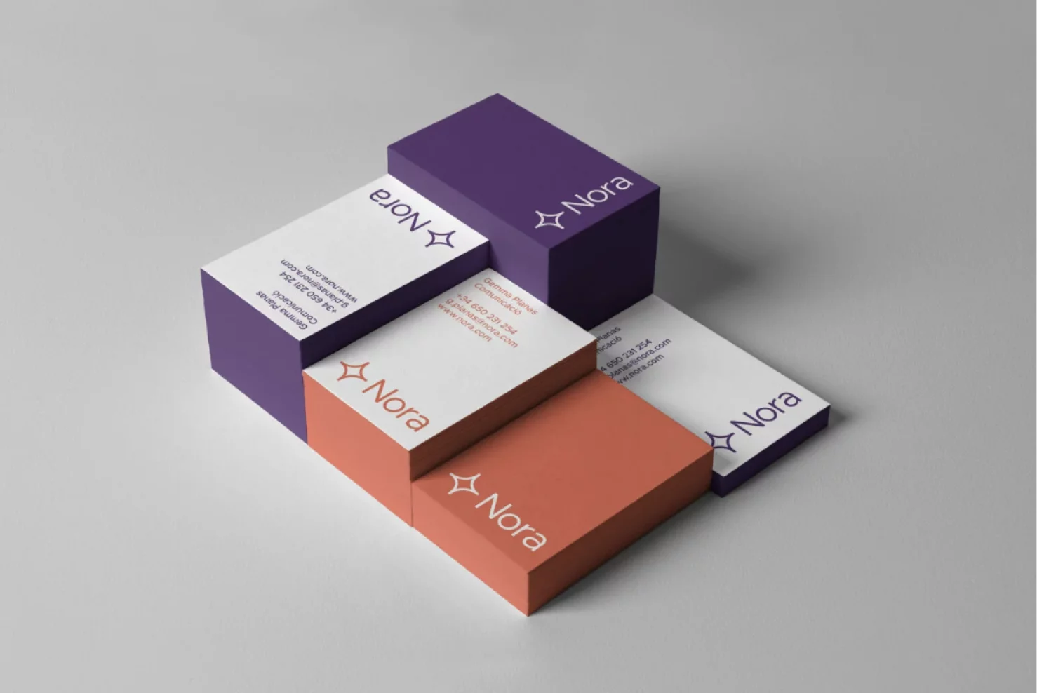
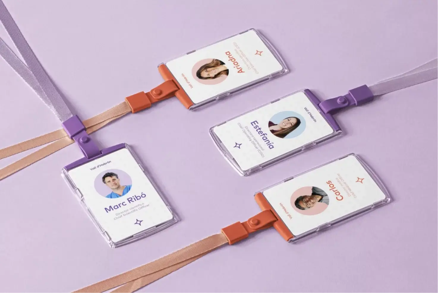
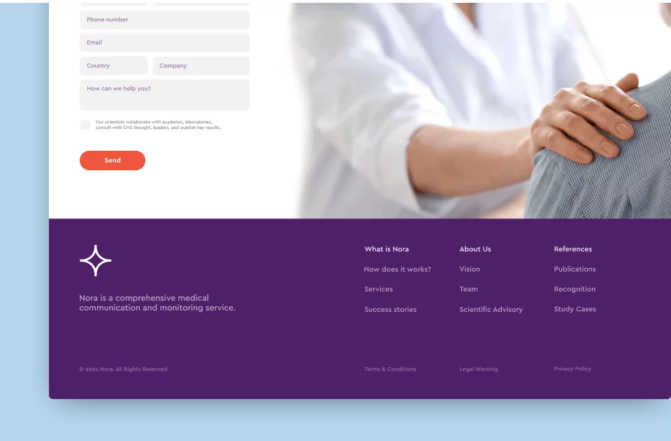
The challenge was combining professional and patient information on a single landing page. After many iterations, the content was reorganized with user priorities first. The solution: a modular design system with consistency across all brand applications, adaptable to digital and physical environments.
BRAND EXPERIENCE
High success rates
Nora's impact has been considerable since its launch; 2,460 patients in 16 different use cases have used the app. It has achieved 78% adherence from patients and a 9/10 satisfaction rate among healthcare professionals.