
What are the seven principles of web design?
- Nacar Design Team
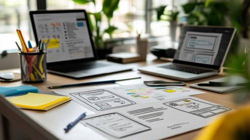
In the digital age, where a website often serves as the first point of contact between a business and its customers, the importance of effective web design cannot be overstated. A well-designed website not only attracts visitors but also converts them into loyal customers. To achieve this, web designers rely on fundamental concepts known as the principles of web design. Understanding these principles helps create user-friendly, aesthetically pleasing, and functional websites.
Next, with NacarDesign, we delve into the seven key principles that form the basis of effective web design.
Balance
Balance in web design refers to the distribution of visual elements on a page. Achieving a balanced layout ensures that the website does not feel lopsided or chaotic. There are two types of balance: symmetrical and asymmetrical. Symmetrical balance is achieved by evenly distributing elements around a central axis, giving a formal and organized feel. On the other hand, asymmetrical balance uses differing weights of elements to create visual interest and dynamism. Regardless of the approach taken, achieving balance enhances the overall user experience and makes the site more enjoyable to navigate.
Contrast
Contrast is essential in web design as it helps differentiate between various elements on a page. By using contrasting colors, fonts, and sizes, designers can guide users’ attention to key features, such as calls to action or important information. For instance, a bright button against a dark background will stand out, encouraging users to click. Additionally, contrast can be used to improve readability, ensuring that text is easy to read against its background. Implementing contrast effectively can significantly enhance the aesthetic appeal of a website while improving usability.
Repetition
Repetition is a principle that emphasizes the consistent use of visual elements throughout a website. This could include colors, fonts, shapes, and layout styles. By repeating certain design elements, designers create a cohesive look and feel, which helps establish a brand identity. For example, using the same button style on every page reinforces brand consistency and provides users with a familiar experience as they navigate through the site. Repetition not only aids in branding but also enhances user recognition and navigation efficiency.

Alignment
Alignment refers to how elements are arranged on a page. Proper alignment creates a visual connection between items and helps establish a sense of order. Every element should be aligned in a way that it appears purposeful rather than randomly placed. For instance, aligning text and images to a grid can create a clean and professional appearance. This principle is crucial because misalignment can lead to confusion, making it difficult for users to focus on the content. Well-aligned elements guide users smoothly through the website, improving the overall experience.
Proximity
Proximity relates to how close or far apart elements are positioned on a page. Grouping related items together helps users understand the relationship between them, enhancing their comprehension of the content. For instance, placing a product image close to its description makes it clear that they are connected. On the contrary, if unrelated items are too close to one another, it can create confusion and overwhelm the user. Utilizing proximity effectively can streamline information and help guide users to find what they need more quickly.
Whitespace
Often overlooked, whitespace (or negative space) is crucial in web design. It refers to the empty areas around elements on a page. Adequate whitespace prevents clutter and enhances readability by giving elements room to breathe. It allows users to focus on the important content without feeling overwhelmed. Effective use of whitespace can highlight key elements, making them stand out. A well-designed website often has a good balance of content and whitespace, contributing to a clean and professional appearance.
Hierarchy
Hierarchy in web design refers to the arrangement of elements in a way that signifies importance. This principle guides users through the content, ensuring they notice the most critical information first. Designers achieve hierarchy through size, color, contrast, and placement. For example, headings are typically larger and bolder than body text, indicating their significance. Establishing a clear visual hierarchy enables users to navigate the site intuitively, leading to a better overall user experience.
Compuestos termoplásticos moldeados; ligeros y reciclables. El proyecto BCPR.
Ander
7 de August de 2025
Moulded thermoplastic composites; lightweight and recyclable. The BCPR project.
Admin
7 de August de 2025