
How to Create Powerful Microinteractions
- Nacar Design Team
Small details shape user perception more than you think.
Microinteractions focus on single tasks, yet they transform routine actions into memorable moments. These subtle interface elements make websites feel intuitive and polished while adding distinctive touches that set your designs apart.
Dan Saffer’s 2014 book, Microinteractions, highlighted how these small details can significantly enhance user experience. They engage users, display system status, prevent errors, and express brand values. Smart implementation leads to intuitive cues that elevate the overall experience.
This guide explores how to create effective microinteractions—from core concepts to practical implementation. We’ll examine UI examples, offer best practices, and share tools to help you design interfaces that function smoothly and delight users.
What Are Microinteractions?
Microinteractions work behind the scenes to enhance user experience. These small design elements are strategic interface components that impact how users interact with your product.
Definition and purpose
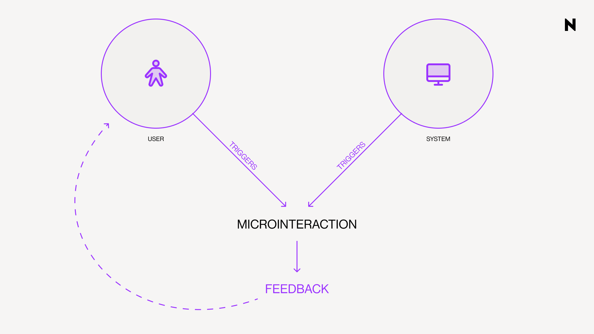
A microinteraction is a small, task-based interaction in digital products that provides feedback or visual responses to user actions. These contained product moments revolve around a single use case with one main task. They're the digital equivalent of a shopkeeper's smile or the satisfying click when closing a well-made box.
Microinteractions serve essential purposes in UI design:
 • Provide immediate feedback to users about their actions
 • Guide users through interfaces with subtle cues
 • Transform routine actions into memorable moments
 • Enhance the overall intuitiveness and engagement of products
 • Communicate brand personality and values
Well-designed microinteractions improve user experience by encouraging engagement, displaying system status, preventing errors, and reducing user friction with smoother interactions.
Core micro-interactions explained
Dan Saffer's framework defines four fundamental parts that work together to create complete experiences: trigger, rule, feedback, and loops and modes.
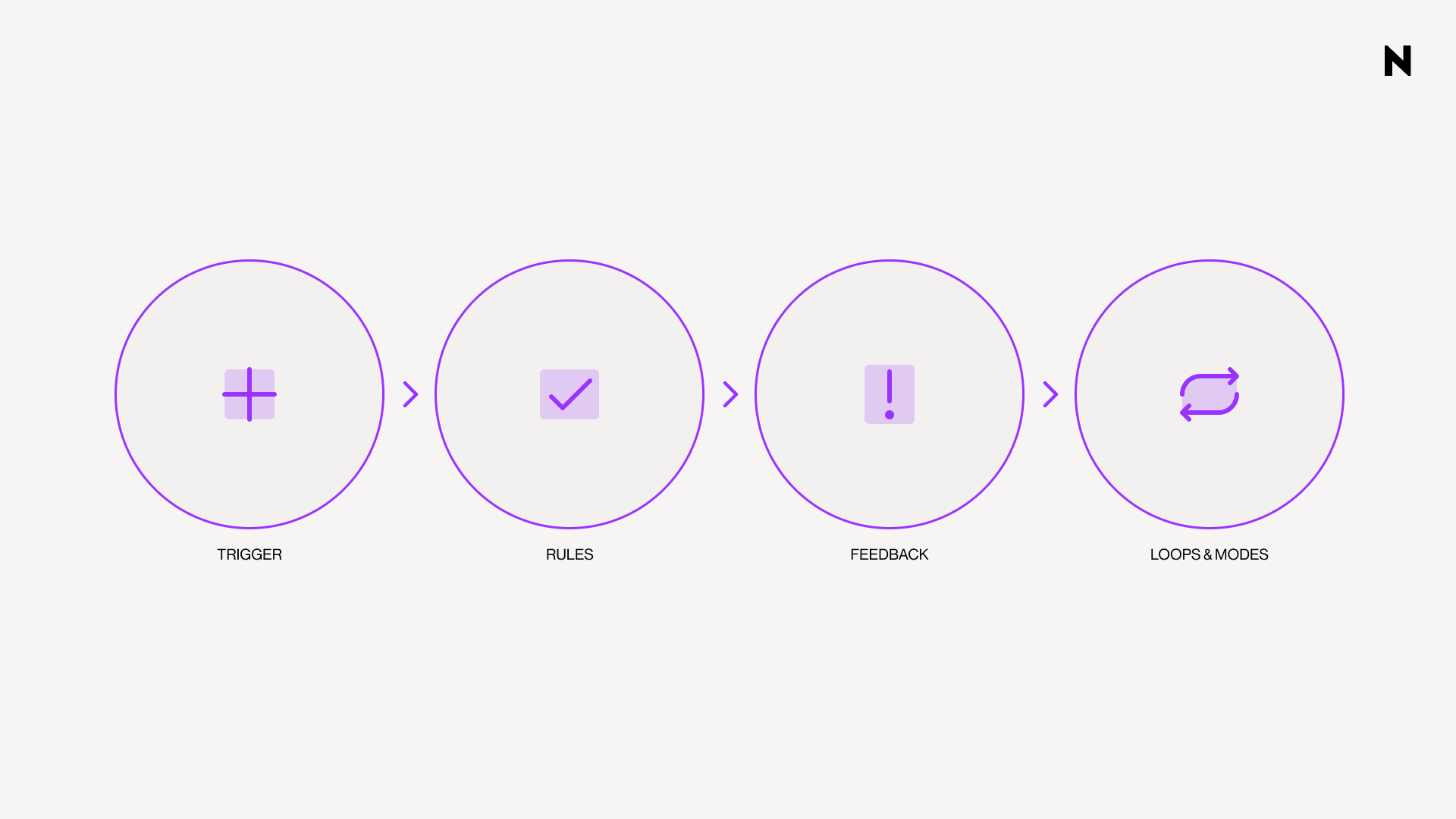
 1. TRIGGERS are what start a microinteraction and can be either explicit or implicit. Explicit triggers are user-initiated, when someone clicks, swipes, or scrolls to take action. Implicit triggers are system-initiated, meaning the microinteraction starts automatically when certain conditions are met, such as receiving a notification or a change in system status.
 2. RULES determine what happens after a trigger activates. They govern how the system responds and must be logical to match user expectations. When clicking a button, a popup appears or an animation begins.
 3. FEEDBACK keeps users informed about what's happening during the interaction. This crucial component can be visual, auditory, or haptic, letting users know their action was recognized. Inline validation during payment processes shows this perfectly: red borders indicate errors, green confirms success.
 4. LOOPS AND MODES define the meta-rules of microinteractions. Modes represent settings that remain in place until changed, whereas loops determine how long the microinteraction continues or if it repeats. In a time-tracking app, the project you're working on is the mode, and the updating duration is the loop.
How they differ from animations
Microinteractions and animations serve different purposes in UI design. Microinteractions focus on functionality and direct user engagement, whereas micro-animations focus on visual appeal and indirect user guidance.
“All microinteractions include some form of animation or feedback mechanism, but not all animations qualify as microinteractions.”
Micro-animations are small, visual animations that draw attention to certain elements or actions on a page. They're a subset of visual design that can be part of microinteractions but don't necessarily involve user interaction. A loading spinner is a micro-animation, but doesn't respond to specific user actions.
All microinteractions include some form of animation or feedback mechanism, but not all animations qualify as microinteractions. The key distinction lies in purpose: microinteractions always serve functional roles tied to specific user actions or system conditions, making them essential components of intuitive interfaces rather than decorative elements.
Spotting Opportunities in UI Design
Digital interfaces offer countless moments for micro-interaction implementation. The key lies in identifying where these elements create the most impact.
Where micro-interactions fit in UI
Strategic placement transforms ordinary interactions into engaging experiences. These moments fit naturally across several UI contexts:
 • Navigation elements: Hover effects on menu items signal interactivity, telling users "you can click here." This makes websites more intuitive to explore..
 • Form validation: Immediate feedback through checkmarks or colored indicators guides users through processes without frustration.
 • Loading states: Progress bars and spinners keep users informed during wait times, managing expectations and reducing perceived latency.
 • Button states: Visual or haptic feedback when pressed confirms actions have registered, fostering trust and reducing repeated clicks..
 • Empty states: Smart micro-interactions turn potentially disappointing moments into opportunities for guidance or brand expression.
Micro-interactions excel at error prevention. Rather than showing error messages after submission, well-placed interactions guide users to correct mistakes as they occur.
Common triggers in digital products
Every micro-interaction starts with a trigger. Recognizing these opportunities is essential for effective implementation.
System-initiated triggers activate automatically when conditions are met:
 • Notifications when messages arrive
 • Low battery alerts
 • Timeout warnings
 • Automatic updates
 • Contextual recommendations
Micro-interactions vs system feedback
Micro-interactions focus on single tasks and typically involve user engagement with specific interface elements. They're brief, contextual moments responding directly to user actions or system conditions.
System feedback communicates broader application status information. While all micro-interactions provide feedback, not all feedback qualifies as a micro-interaction.
A loading spinner is system feedback. Combined with progress percentage and completion animation, it becomes a complete micro-interaction that keeps users informed and engaged.
The most effective interfaces blend both approaches, using micro-interactions to enhance specific moments while maintaining consistent system feedback throughout the experience.
Designing Microinteractions Step-by-Step
Effective microinteractions demand systematic thinking.
Four critical steps balance functionality with user delight. Each step builds toward micro-interactions that enhance interfaces without overwhelming users.
Step 1: Define the user goal
Start with purpose. What is the user trying to achieve?
Identify the specific task your micro-interaction will support:
 • What context surrounds this interaction?
 • How does this benefit the user experience?
 • What problem does it solve?
The best micro-interactions serve clear purposes first. Delightful elements enhance function, never overshadow it. A form submission button confirms success before adding celebration.
Task diagrams or storyboards help visualize the interaction. This preliminary work establishes the foundation for all design decisions.
Step 2: Choose the right trigger
Every micro-interaction needs its catalyst.
User-initiated triggers require direct action:
 • Clicks, taps, button presses
 • Swipes, scrolls, gestures
 • Hover actions (effective for tooltips)
 • Form field interactions
System-initiated triggers activate automatically:
 • Message notifications
 • Process completion alerts
 • Timeout warnings
 • Status updates
Context determines the right choice. Hover-triggered tooltips provide information without interrupting workflow. Click-triggered animations offer satisfying confirmation.
Step 3: Set rules and feedback
Rules determine what happens after trigger activation.
Consider these questions:
 • What occurs immediately after the trigger?
 • What control does the user maintain?
 • How does this align with user expectations?
Feedback communicates rules to users. Visual, auditory, or haptic responses acknowledge user actions immediately.
Form submission is a great example of effective feedback: red borders highlight missing or incorrect fields, while a success message confirms the form was sent. This immediate response creates satisfaction, turning mundane tasks into engaging moments. Keep feedback quick (300-500 milliseconds) and consistent with your design language.
Step 4: Add loops and modes
The final step determines behavior over time.
Loops define duration and repetition:
 • Play once and disappear?
 • Repeat until acknowledged?
 • Change with repeated use?
Loading indicators loop continuously until content loads. Confirmation animations play once.
Modes modify behaviors based on conditions:
 • Time of day or location
 • User history or preferences
 • Current application state
Time-tracking apps show this clearly. The project represents a mode, the timer display represents a loop.
These meta-rules add sophistication, making micro-interactions responsive to context.
Test with real users throughout this process. What delights you might frustrate others. Refine based on feedback. These four steps create micro-interactions that enhance functionality while adding memorable moments that distinguish outstanding interfaces.
Best Practices for Better UX
Four principles guide effective microinteraction design.
Keep interactions intuitive
The best microinteractions feel nearly invisible. They accomplish their purpose without demanding attention. Every microinteraction should serve a specific function rather than exist for visual appeal. Users should understand what happens without instructions.
YouTube's like/dislike buttons demonstrate this principle. straightforward options that make interaction effortless and memorable. Simple design helps users make quick decisions without complex options.
Ensure consistency across the product
Consistency builds predictable environments that reduce learning curves. When microinteractions follow similar patterns throughout your interface, users develop confidence in system responses.
Gmail's swipe-to-delete function creates simple, intuitive email management across the entire interface. Plan how each microinteraction relates to others, ensuring all actions follow consistent patterns.
Use feedback to guide users
Immediate feedback confirms system recognition of user actions. Swift communication prevents confusion and creates smoother interaction flows. Google's search auto-complete offers real-time suggestions as users type, helping them find information faster.
Avoid overuse or distraction
Microinteractions should enhance user experience without interrupting workflow or slowing systems. They must scale effectively across different devices and screen sizes.
Design animations for brevity to maintain natural feel. Focus on practical application over decoration. Every microinteraction should contribute meaningfully to the overall experience.
Real-World Examples and Inspiration
Successful implementations prove how micro-interactions work in practice. These examples show effective approaches you can adapt for your own projects.
Facebook reactions and hover effects
Facebook's reaction system demonstrates smart micro-interaction design. The standard like button serves its basic function, but tap-and-hold reveals animated emojis expressing different emotions. These emojis move in real-time, creating engaging moments that go beyond simple clicks.
Hover functionality adds another layer, moving over the like button displays emotional reactions without cluttering the interface. This approach gives users expressive options while maintaining clean design.
Asana's unicorn celebration
Asana turns task completion into celebration moments. Users occasionally see playful animations featuring "celebration creatures", mainly a unicorn flying across the screen. This unpredictable reward system makes routine achievements feel special.
The celebration team features five characters:
 • Unicorn: "The leader and dreamer" with "college pyrotechnic skills"
 • Yeti: "Cold" but "sweet," "hides behind completed tasks"
 • Narwhal: "Makes a splash" and "ships results"
 • Phoenix: "Not scared of heat," "action-oriented"
 • Otter: "Very competitive" with "high EQ and IQ"
These moments provide instant gratification, making small wins feel significant.
Google Assistant's listening dots
Google Assistant's dots solve a practical feedback challenge. These animated elements appear in two stages using Google's four signature colors. "Hey Google" triggers bouncing spheres showing readiness to listen. Speaking transforms dots into sound wave animations. This design confirms system responsiveness during voice interactions. Users get immediate visual proof their commands are being processed.
Micro interactions website examples
Many websites use micro-interactions effectively:
WWF employs hover effects in navigation revealing dropdown options, plus scroll-triggered text reveals with fade-in animations. Stone Cycling features horizontal scroll carousels with arrow controls for browsing, alongside interactive form elements that fill when selected.
Rocket Air creates unique cursor interactions where moving a play button triggers video transitions, sparking curiosity that drives exploration.
FAQs
Q1. What are microinteractions in UI design?
Microinteractions are small, task-based interactions in digital products that provide feedback or visual responses to user actions. They serve to enhance user experience by providing immediate feedback, guiding users through interfaces, and transforming routine actions into memorable moments.
Q2. How do microinteractions differ from animations?
While microinteractions are primarily about functionality and direct user engagement, animations focus more on visual appeal and indirect user guidance. All microinteractions include some form of animation or feedback, but not all animations qualify as microinteractions. The key distinction lies in their purpose - microinteractions always serve functional roles tied to specific user actions or system conditions.
Q3. What are the four fundamental parts of a microinteraction?
The four fundamental parts of a microinteraction are triggers (which initiate the interaction), rules (which determine what happens after a trigger activates), feedback (which keeps users informed about what's happening), and loops and modes (which define how long the microinteraction continues or if it repeats).
Q4. Can you provide some examples of effective microinteractions?
Some effective microinteractions include Facebook's reaction feature, where emojis come alive through real-time movements, Asana's celebratory animations featuring creatures like unicorns upon task completion, and Google Assistant's floating dots that indicate readiness to listen and process voice commands.
Q5. What are some best practices for designing microinteractions?
Key best practices for designing microinteractions include keeping interactions intuitive and simple, ensuring consistency across the product, using feedback to guide users, and avoiding overuse or distraction. It's important to focus on practical application over decoration and ensure that every microinteraction contributes meaningfully to the overall user experience.
Compuestos termoplásticos moldeados; ligeros y reciclables. El proyecto BCPR.
Ander
7 de August de 2025
Moulded thermoplastic composites; lightweight and recyclable. The BCPR project.
Admin
7 de August de 2025